WHAT DO DATA ANALYSTS DO?
Data analysts translate numbers into plain english. Every business collects data, whether it's sales figures, market research, logistics, or transportation costs. A data analyst's job is to take that data and use it to help companies make better business decisions. This could mean figuring out how to price new materials for the market, how to reduce transportation costs, solve issues that cost the company money, or determine how many people should be working on Saturdays.
There are many different types of data analysts in the field, including operations analysts, marketing analysts, financial analysts, etc.
- Interpret data, analyze results using statistical techniques and provide ongoing reports.
- Identify, analyze, and interpret trends or patterns in complex data sets.
- Filter and “clean” data, and review computer reports, printouts, and performance indicators to locate and correct code problems.
- Work closely with management to prioritize business and information needs.
- Locate and define new process improvement opportunities.
Analytics
People often tend to confuse between some of the terms, frequently used interchangeably:
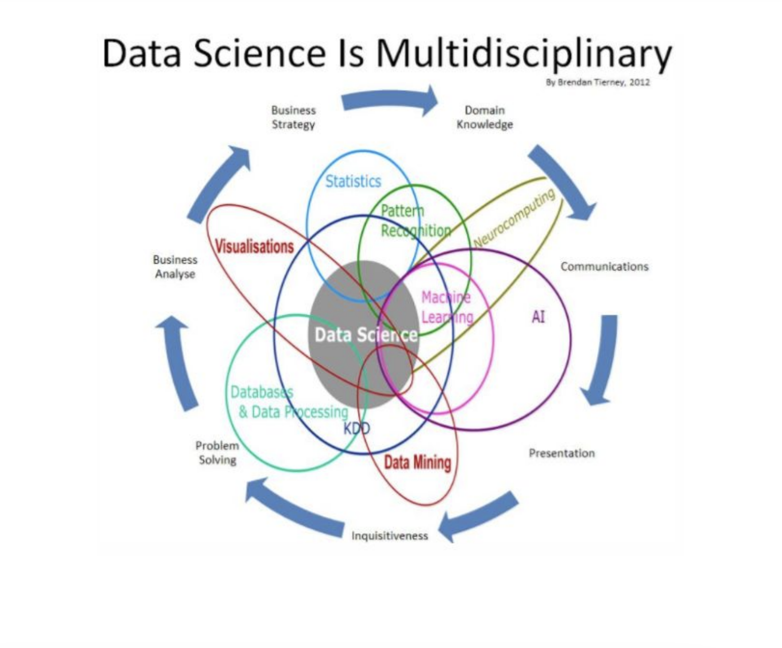
- Data Science: Refers to the umbrella of techniques where you are trying to extract information and insights from data. This includes MIS reporting on the lowest level to building predictive models on the higher level.
- Data Mining: Refers to the science of collecting all the past data and then searching for patterns in this data. You look for consistent patterns and/or relationships between variables. Once you find these insights, you validate the findings by applying the detected patterns to new subsets of data. The ultimate goal of data mining is prediction - and predictive data mining is the most common type of data mining and one that has the most direct business applications.
- Data Analysis: This is a loosely used term. People running reporting also say that they are analysing data and so do predictive modelers. Any attempt to make sense of data can be called as data analysis.
- Machine learning - is the science of creating algorithms and program which learn on their own. Once designed, they do not need a human to become better. Some of the common applications of machine learning include following: Web Search, spam filters, recommender systems, ad placement, credit scoring, fraud detection, stock trading, computer vision and drug design. An easy way to understand is this - it is humanly impossible to create models for every possible search or spam, so you make the machine intelligent enough to learn by itself. When you automate the later part of data mining - it is known as machine learning.
What is Machine Learning?
One of the standard definitions of machine learning, as given by Tom Mitchell – a Professor at the Carnegie Mellon University (CMU), is a computer program is said to learn from experience E with respect to some class of tasks T and performance measure P, if its performance at tasks in T, as measured by P, improves with experience E or simply put, the program learns through its experience to build better performing models.
Machine learning is a method of data analysis that automates analytical model building. Using algorithms that iteratively learn from data, machine learning allows computers to find hidden insights without being explicitly programmed where to look.
Resurging interest in machine learning is due to the same factors like growing volumes and varieties of available data, computational processing that is cheaper and more powerful, and affordable data storage have made more popular than ever.
All of these things mean it's possible to quickly and automatically produce models that can analyze bigger, more complex data and deliver faster, more accurate results – even on a very large scale. And by building precise models, an organization has a better chance of identifying profitable opportunities – or avoiding unknown risks.
Types of Machine Learning Algorithms
Although people tend to come up with a different categorization of ML algorithms according to the need at a broad level, one can categorize algorithms based on the way data is provided to learn from. The following are the main categorization of learning algorithms:
- Supervised Learning: In this setting, we provide a model a training data set, which consists of the data and the true labels. Given this data, a model is learned. Obviously here, the more the data, the better the model will perform on unknown examples. Key factors here are that the model should generalize to unseen examples. Classification, Regression, Ranking fall under this learning paradigm.
- Unsupervised Learning: In this setting, the model automatically organizes data without any labeled examples. Examples of this include Clustering of Data, Summarization etc. Data is organized based on the similarity of the data items.
- Semi Supervised Learning: This is a hybrid between unsupervised and supervised, where some of the data is labeled, while a large pool of the data is actually unlabeled. Algorithms here take the entire labeled data, and intelligently use the unlabeled data to improve the model performance.
- Online Learning/ Active Learning: In this paradigm, the algorithms keep improving itself by using feedback of a human in the loop.
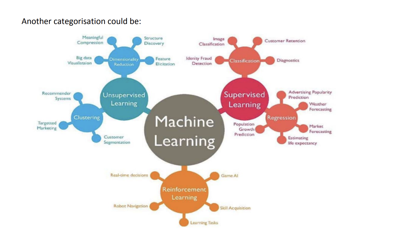
Within each of these paradigms of learning, there are several different modeling techniques. Of course, before even getting to the modeling aspect (i.e. which machine learning model to use, one must choose the right set of features. This is called Feature engineering , and this often plays a significant role in getting good results. This also often requires domain expertise.
Introduction to Excel as an analytics tool
Even before learning R or Python, it is advisable to have knowledge of Excel. It does no harm to add excel in your skill sets. Excel, with its wide range of functions, visualization, arrays empowers you to quickly generate insights from data which would be hard to see otherwise.
It has a few drawbacks as well. It can’t handle large data sets very efficiently. Excel has numerous functions. It becomes confusing at times to choose the best one. Here, some tips and tricks to work on Excel and save your time are given. This article is best suited to people keen to upgrade their data analysis skills.
Installing Excel Analytics Package
https://www.youtube.com/watch?v=_yNxLFagKgw
XLStat an Introduction
https://www.youtube.com/watch?v=pjyNNiDKrKs
Commonly used functions
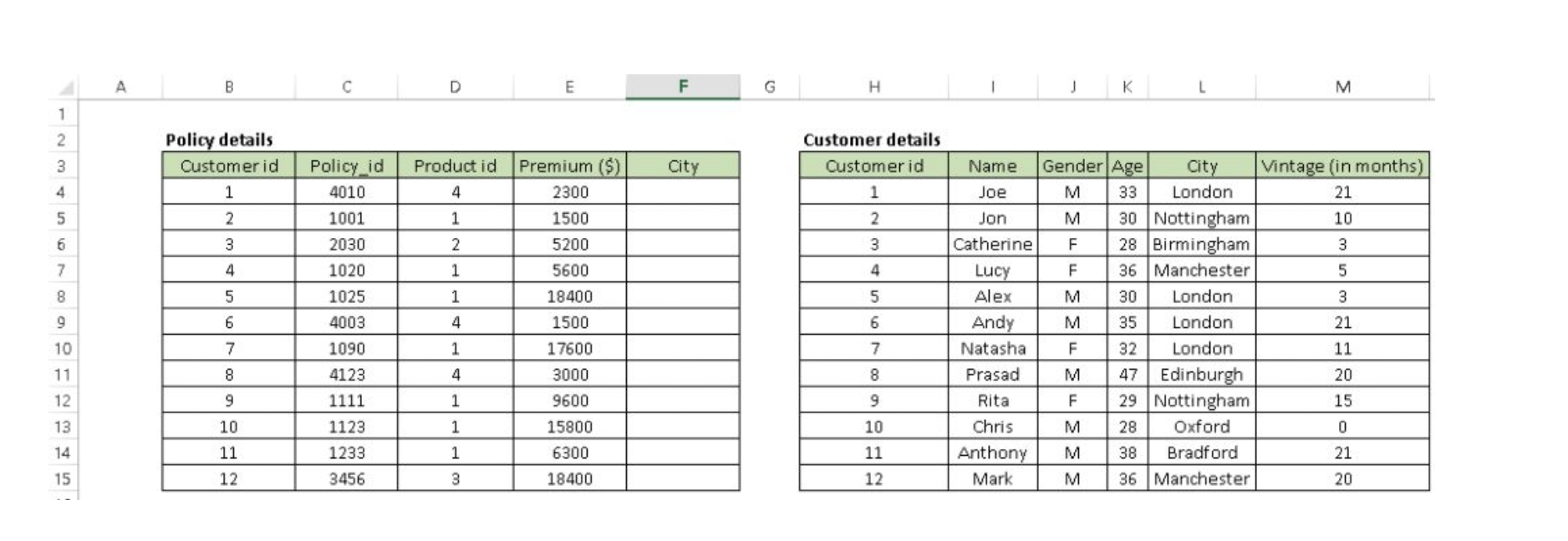
1. Vlookup(): It helps to search a value in a table and returns a corresponding value. Let’s look at the table below (Policy and Customer). In Policy table, we want to map city name from the customer tables based on common key “Customer id”. Here, function vlookup() would help to perform this task.
Syntax: =VLOOKUP(Key to lookup, Source_table, column of source table, are you ok with relative match?)
For above problem, we can write formula in cell “F4” as =VLOOKUP(B4, $H$4:$L$15, 5, 0) and this will return the city name for all the Customer id 1 and post that copy this formula for all Customer ids.
Tip: Do not forget to lock the range of the second table using “$” sign – a common error when copying this formula down. This is known as relative referencing. Alternatively, you can use F4 to lock cell reference.
2. CONCATENATE(): It is very useful to combine text from two or more cells into one cell. For example: we want to create a URL based on input of host name and request path

Syntax: =Concatenate(Text1, Text2,.....Textn)
Above problem can be solved using formula, =concatenate(B3,C3) and copy it.
Tip: I prefer using “&” symbol, because it is shorter than typing a full “concatenate” formula, and does the exactly same thing. The formula can be written as “= B3&C3”.
3. LEN() – This function tells you about the length of a cell i.e. number of characters including spaces and special characters .
Syntax: =Len(Text)
Example: =Len(B3) = 23
4. LOWER(), UPPER() and PROPER() –These three functions help to change the text to lower, upper and sentence case respectively (First letter of each word capital).
Syntax: =Upper(Text)/ Lower(Text) / Proper(Text)
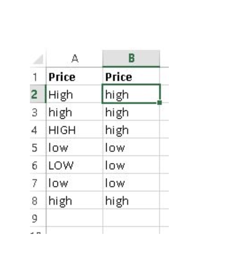
5. TRIM(): This is a handy function used to clean text that has leading and trailing white space. Often when you get a dump of data from a database the text you’re dealing with is padded with blanks. And if you don’t deal with them, they are also treated as unique entries in a list, which is certainly not helpful.
Syntax: =Trim(Text)
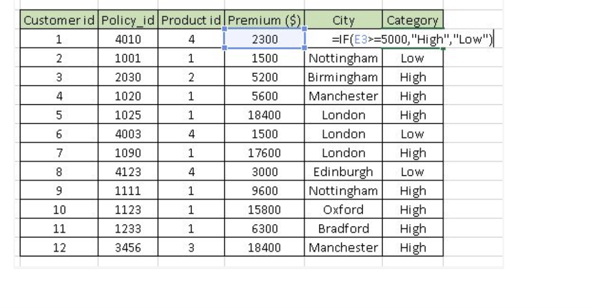
6. If():It is one of the most useful function in excel. It lets you use conditional formulas which calculate one way when a certain thing is true, and another way when false. For example, you want to mark each sales as “High” and “Low”. If sales is greater than or equals to $5000 then “High” else “Low”.
Syntax: =IF(condition, True Statement, False Statement)
Generating inference from Data
1. Pivot Table : Whenever you are working with company data, you seek answers for questions like “How much revenue is contributed by branches of North region?” or “What was the average number of customers for product A?” and many others.
Excel’s Pivot Table helps you to answer these questions effortlessly. Pivot table is a summary table that lets you count, average, sum, and perform other calculations according to the reference feature you have selected i.e. It converts a data table to inference table which helps us to take decisions. Look at below snapshots:
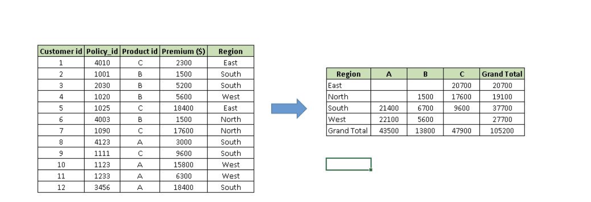
Above, you can see that table on the left has sales detail against each customer with region and product mapping. In table to the right, the information is summarised at region level which now helps us to generate an inference that South region has highest sales.
Methods to create Pivot table:
Step-1: Click somewhere in the list of data. Choose the Insert tab, and click PivotTable. Excel will automatically select the area containing data, including the headings. If it does not select the area correctly, drag over the area to select it manually. Placing the PivotTable on a new sheet is best, so click New Worksheet for the location and then click OK
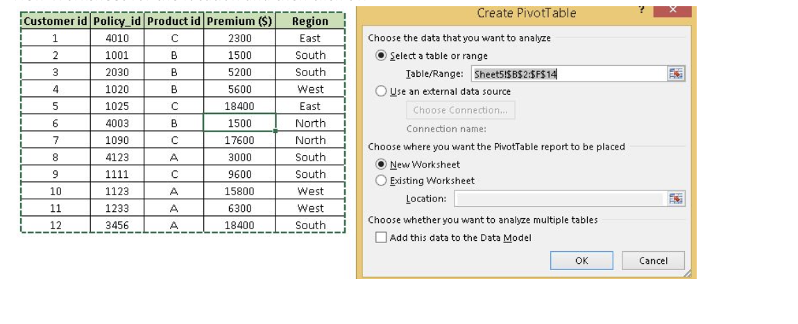
Step-2: Now, you can see the PivotTable Field List panel, which contains the fields from your list; all you need to do is to arrange them in the boxes at the foot of the panel. Once you have done that, the diagram on the left becomes your PivotTable.
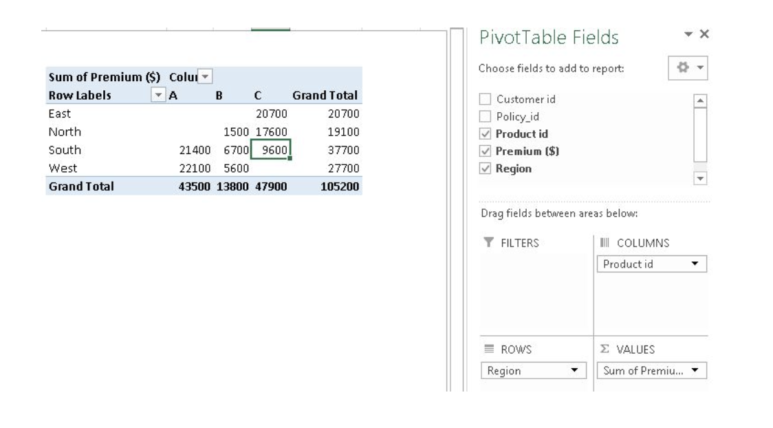
Above, you can see that we have arranged “Region” in row, “Product id” in column and sum of “Premium” is taken as value. Now you are ready with pivot table which shows Region and Product wise sum of premium. You can also use count, average, min, max and other summary metric.
2. Creating Charts: Building a chart/ graph in excel requires nothing more than selecting the range of data you wish to chart and press F11. This will create a excel chart in default chart style but you can change it by selecting different chart style. If you prefer the chart to be on the same worksheet as the data, instead of pressing F11, press ALT + F1. Of course, in either case, once you have created the chart, you can customize to your particular needs to communicate your desired message.
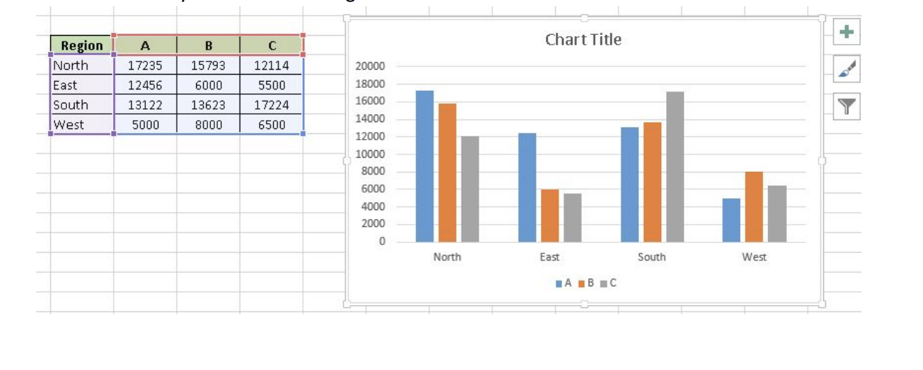
Apart from Excel we have other analytics tools like SAS, R or Python. Using which tool completely depends on the user.
R vs Python
For most data analysis projects, the goal is to create the highest quality analysis in the least amount of time.
If one can understand the underlying concepts behind what they are doing, then they can use either language to perform your analysis.
R has a much bigger library of statistical packages
If you’re doing specialized statistical work, R packages cover more techniques. You can find R packages for a wide variety of statistical tasks using the CRAN task view. R packages cover everything from Psychometrics to Genetics to Finance. Although Python, through SciPy and packages like stats-models, covers the most common techniques, R is far ahead.
Python is better for building analytics tools
R and Python are equally good if you want to find outliers in a dataset, but if you want to create a web service to enable other people to upload datasets and find outliers, Python is better. Python is a general purpose programming language, which means that people have built modules to create websites, interact with a variety of databases, and manage users.
In general, if you want to build a tool or service that uses data analysis, Python is a better choice.
R builds in data analysis functionality by default, whereas Python relies on packages
Because Python is a general purpose language, most data analysis functionality is available through packages like NumPy and pandas. However, since R was built with statistics and data analysis in mind, many tools that have been added to Python through packages are built into base R.
Python is better for deep learning.
Through packages like Lasagne, caffe, keras, and tensorflow, creating deep neural networks is straightforward in Python. Although some of these, like tensorflow, are being ported to R, its support is still far better in Python.
Python relies on a few main packages, whereas R has hundreds of them.
In Python, sklearn is the “primary” machine learning package, and pandas is the “primary” data analysis package. This makes it easy to know how to accomplish a task, but also means that a lot of specialized techniques aren’t possible.
R is better for data visualization.
Packages like ggplot2 make plotting easier and more customizable in R than in Python. Python is catching up, particularly in the area of interactive plots with packages like Bokeh, but has a way to go.
The bottom line :
Performing data analysis tasks in either language is more similar than you might expect. As long as you understand the underlying concepts, pick the language that you’re most familiar with.
R has an edge in statistics and visualization, whereas Python has an advantage in machine learning and building tools.
Introduction to R
R is a powerful language used widely for data analysis and statistical computing. It was developed in early 90s. Since then, endless efforts have been made to improve R’s user interface. The journey of R language from a rudimentary text editor to interactive R Studio and more recently Jupyter Notebooks has engaged many data science communities across the world.
But, what about Machine Learning?
R is not just a language for statistical computing but can be used to implement many machine learning algorithm.
Why learn R?
Here are some benefits of using R:
- The style of coding is quite easy.
- It’s open source. No need to pay any subscription charges.
- Availability of instant access to over 7800 packages customized for various computation tasks.
- The community support is overwhelming. There are numerous forums to help you out.
- Get high performance computing experience (requires packages).
- One of highly sought skill by analytics and data science companies.
How to install R / R Studio?
http://www.ics.uci.edu/~jutts/110/InstallingRandRStudio.pdf
For Windows users, R Studio is available for Windows Vista and above versions. Follow the steps below for installing R Studio:
- Go to https://www.rstudio.com/products/rstudio/download/
- In ‘Installers for Supported Platforms’ section, choose and click the R Studio installer based on your operating system. The download should begin as soon as you click.
- Click Next..Next..Finish.
- Download Complete.
- To Start R Studio, click on its desktop icon or use ‘search windows’ to access the program. It looks like this:

Various parts of the console window:
- R Console: This area shows the output of code you run. Also, you can directly write codes in console. Code entered directly in R console cannot be traced later. This is where R script comes to use.
- R Script: As the name suggest, here you get space to write codes. To run those codes, simply select the line(s) of code and press Ctrl + Enter. Alternatively, you can click on little ‘Run’ button location at top right corner of R Script.
- R environment: This space displays the set of external elements added. This includes data set, variables, vectors, functions etc. To check if data has been loaded properly in R, always look at this area.
- Graphical Output: This space display the graphs created during exploratory data analysis. Not just graphs, you could select packages, seek help with embedded R’s official documentation.
How to install R Packages?
The sheer power of R lies in its incredible packages. In R, most data handling tasks can be performed in 2 ways: Using R packages and R base functions. To install a package, simply type:
install.packages("package name")
As a first time user, a pop might appear to select your CRAN mirror (country server), choose accordingly and press OK.
Note: You can type this either in console directly and press ‘Enter’ or in R script and click ‘Run’.
https://www.r-bloggers.com/installing-r-packages/
Python
For aspiring Data Scientists, Python is probably the most important language to learn because of its rich ecosystem.
Python's major advantage is its breadth. For example, R can run Machine Learning algorithms on a
preprocessed dataset, but Python is much better at processing the data. Pandas is an incredibly useful
library that can essentially do everything SQL does and more. matplotlib lets you create useful
visualizations to quickly understand your data.
In terms of algorithm availability, you can get plenty of algorithms out of the box with scikit-learn. And
if you want to customize every detail of your models, Python has Theano. In addition, Theano is easily
configured to run on the GPU, which gives you a cheap and easy way to get much higher speeds
without having to change a single line of code or delve into performance details.
Introduction to Python
Step 0: Warming up
Before starting your journey, the first question to answer is:
Why use Python?
or
How would Python be useful?
Watch the first 30 minutes of this talk from Jeremy, Founder of DataRobot at PyCon 2014, Ukraine to get an idea of how useful Python could be.
https://www.youtube.com/watch?v=CoxjADZHUQA
Step 1: Setting up your machine
The easiest way to proceed is to just download Anaconda from Continuum.io. It comes packaged with most of the things you will need ever. The major downside of taking this route is that you will need to wait for Continuum to update their packages, even when there might be an update available to the underlying libraries. If you are a starter, that should hardly matter.
If you face any challenges in installing, you can find more detailed instructions for various OS here.
Step 2: Learn the basics of Python language
You should start by understanding the basics of the language, libraries and data structure. The free interactive Python tutorial by DataCamp is one of the best places to start your journey. This 4-hour coding course focuses on how to get started with Python for data science, and by the end you should be comfortable with the basic concepts of the language.
https://www.datacamp.com/courses/intro-to-python-for-data-science
Specifically learn: Lists, Tuples, Dictionaries, List comprehensions, Dictionary comprehensions
Alternate resources: If interactive coding is not your style of learning, you can also look at The Google Class for Python. It is a 2-day class series and also covers some of the parts discussed later.
https://developers.google.com/edu/python/
Step 3: Learn Regular Expressions in Python
You will need to use them a lot for data cleansing, especially if you are working on text data. The best way to learn Regular expressions is to go through the Google class and keep this cheat sheet handy.
Assignment: Do the baby names exercise
If you still need more practice, follow this tutorial for text cleaning. It will challenge you on various steps involved in data wrangling.
Step 4: Learn Scientific libraries in Python – NumPy, SciPy, Matplotlib and Pandas
This is where fun begins! Here is a brief introduction to various libraries. Let’s start practicing some common operations.
- Practice the NumPy tutorial thoroughly, especially NumPy arrays. This will form a good foundation for things to come.
- Next, look at the SciPy tutorials. Go through the introduction and the basics and do the remaining ones basis your needs.
- If you guessed Matplotlib tutorials next, you are wrong! They are too comprehensive for our need here. Instead look at this ipython notebook till Line 68 (i.e. till animations)
- Finally, let us look at Pandas. Pandas provide DataFrame functionality (like R) for Python. This is also where you should spend good time practicing. Pandas would become the most effective tool for all mid-size data analysis. Start with a short introduction, 10 minutes to pandas. Then move on to a more detailed tutorial on pandas.
Additional Resources:
- If you need a book on Pandas and NumPy, “Python for Data Analysis by Wes McKinney”
- There are a lot of tutorials as part of Pandas documentation. You can have a look at them here
Step 5: Effective Data Visualization
We’ll be discussing more on data visualisation in next module.
Step 6: Learn Scikit-learn
Now, we come to the meat of this entire process. Scikit-learn is the most useful library on python for machine learning. Here is a brief overview of the library.
Additional Resources:
- If there is one book, you must read, it is Programming Collective Intelligence – a classic, but still one of the best books on the subject.
- Additionally, you can also follow one of the best courses on Machine Learning course from Yaser Abu-Mostafa. If you need more lucid explanation for the techniques, you can opt for the Machine learning course from Andrew Ng and follow the exercises on Python.
Step 7: Practice, practice and Practice
It is a matter of practice and what better place than Kaggle it give all what you have learnt a try!
Data Visualisation Tools
Tableau
Tableau is a Business Intelligence tool for visually analyzing the data. You can create and distribute an interactive and shareable dashboard, which depict the trends, variations, and density of the data in the form of graphs and charts. Tableau can connect to files, relational and Big Data sources to acquire and process data. The software allows data blending and real-time collaboration, which makes it very unique. It is used by businesses, academic researchers, and many government organizations for visual data analysis. It is also positioned as a leader Business Intelligence and Analytics Platform in Gartner Magic Quadrant.
Tableau Features
- Speed of Analysis − As it does not require high level of programming expertise, any user with access to data can start using it to derive value from the data.
- Self-Reliant − Tableau does not need a complex software setup. The desktop version which is used by most users is easily installed and contains all the features needed to start and complete data analysis.
- Visual Discovery −One can explore and analyze the data by using visual tools like colors, trend lines, charts, and graphs. There is very little script to be written as nearly everything is done by drag and drop.
- Blend Diverse Data Sets − Tableau allows one to blend different relational, semistructured and raw data sources in real time, without expensive up-front integration costs. One doesn't need to know the details of how data is stored.
- Architecture Agnostic − Tableau works in all kinds of devices where data flows. Hence, one doesn't need not worry about specific hardware or software requirements to use Tableau.
- Real-Time Collaboration − Tableau can filter, sort, and discuss data on the fly and embed a live dashboard in portals like SharePoint site or Salesforce. One can save your view of data and allow colleagues to subscribe to your interactive dashboards so they see the very latest data just by refreshing their web browser.
- Centralized Data − Tableau server provides a centralized location to manage all of the organization’s published data sources. One can delete, change permissions, add tags, and manage schedules in one convenient location. It’s easy to schedule extract refreshes and manage them in the data server. Administrators can centrally define a schedule for extracts on the server for both incremental and full refreshes.
Download Tableau Desktop
The Free Personal Edition of Tableau Desktop can be downloaded from Tableau Desktop. You need to register with your details to be able to download.
After downloading, the installation is a very straightforward process in which you need to accept the license agreement and provide the target folder for installation. The following steps and screenshots describe the entire setup process.
Start the Installation Wizard
Getting Started
In this chapter, one will learn some basic operations in Tableau to get acquainted with its interface. There are three basic steps involved in creating any Tableau data analysis report.
These three steps are −
- Connect to a data source − It involves locating the data and using an appropriate type of connection to read the data.
- Choose dimensions and measures − This involves selecting the required columns from the source data for analysis.
- Apply visualization technique − This involves applying required visualization methods, such as a specific chart or graph type to the data being analyzed.
For convenience, let’s use the sample data set that comes with Tableau installation named sample – superstore.xls. Locate the installation folder of Tableau and go to My Tableau Repository. Under it, you will find the above file at Datasources\9.2\en_US-US.
Connect to a Data Source
On opening Tableau, you will get the start page showing various data sources. Under the header
“Connect”, you have options to choose a file or server or saved data source. Under Files, choose excel.
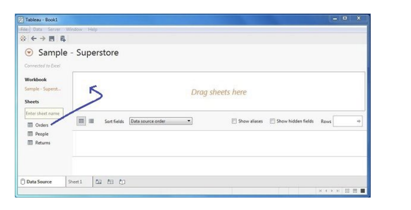
Then navigate to the file “Sample – Superstore.xls” as mentioned above. The excel file has three
sheets named Orders, People and Returns. Choose Orders.
Choose the Dimensions and Measures
Next, choose the data to be analyzed by deciding on the dimensions and measures. Dimensions are
the descriptive data while measures are numeric data. When put together, they help visualize the
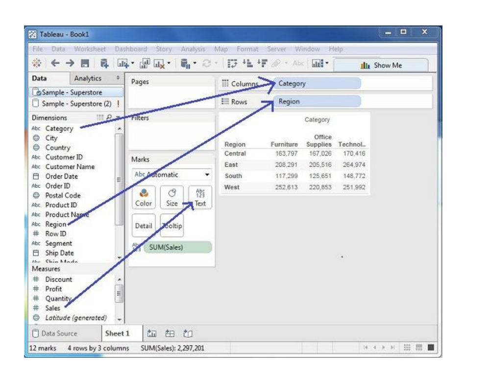
performance of the dimensional data with respect to the data which are measures. Choose Category
and Region as the dimensions and Sales as the measure. Drag and drop them as shown in the
following screenshot. The result shows the total sales in each category for each region.
Apply Visualization Technique
In the previous step, one can see that the data is available only as numbers. One has to read and
calculate each of the values to judge the performance. However, one can see them as graphs or
charts with different colors to make a quicker judgment.
We drag and drop the sum (sales) column from the Marks tab to the Columns shelf. The table showing
the numeric values of sales now turns into a bar chart automatically.
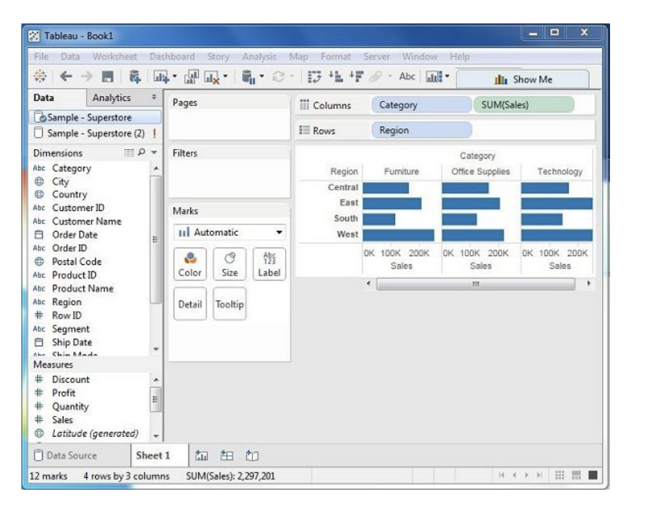
One can add another dimension to the existing data. This will add more colors to the existing bar chart as shown in the following screenshot.

Now, one will get acquainted with various navigational features available in Tableau interface. When
running Tableau desktop, one will get the menu at the top which shows all the commands we can
navigate. On opening a blank workbook, you can go through the various important features under
each menu.
Menu Commands
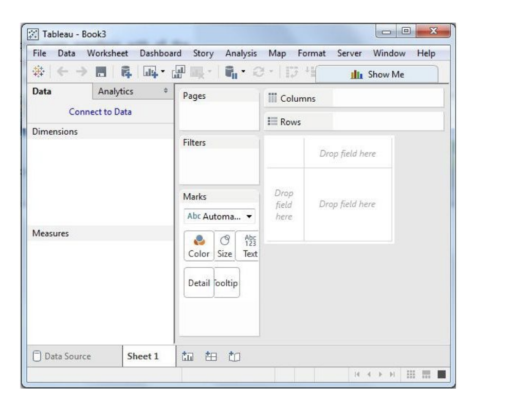
When one closes the getting started window, one gets the main interface with all the available Menu
commands. They represent all the features available in Tableau. Different sections of the menu are
shown in the following diagram. Next, you can observe some details of each menu.
File Menu
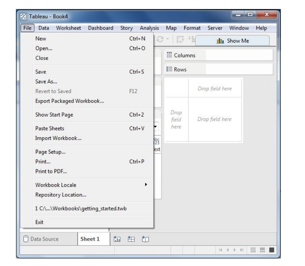
This menu can be used to create a new Tableau workbook and open existing workbooks from both the local system and Tableau server. The important features in this menu are −
- Workbook Locale sets the language to be used in the report.
- Paste Sheets pastes a sheet into the current workbook, which is copied from another workbook.
- Export Packaged Workbook option is used to create a packaged workbook, which will be shared with other users.
Data Menu
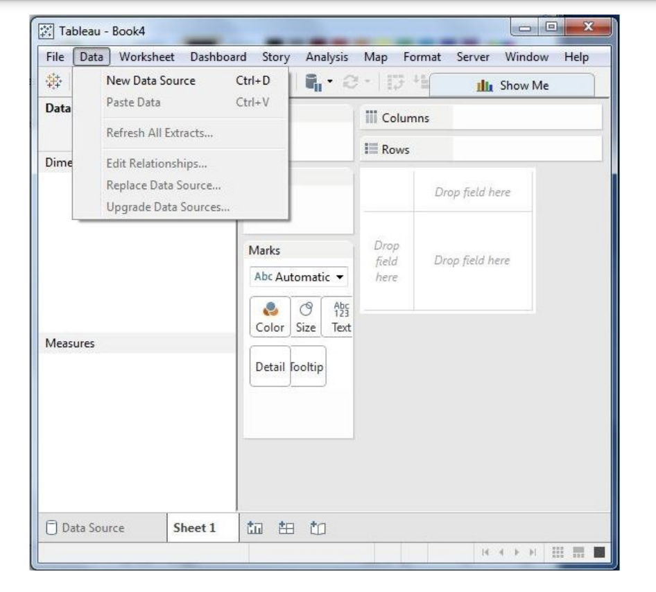
This menu is used to create new data source to import the data for analysis and visualization. It also allows you to replace or upgrade the existing data source.
The important features in this menu are as follows −
- New Data Source allows to view all the types of connections available and choose from it.
- Refresh All Extracts refreshes the data from the source.
- Edit Relationships option defines the fields in more than one data source for linking.
Worksheet Menu
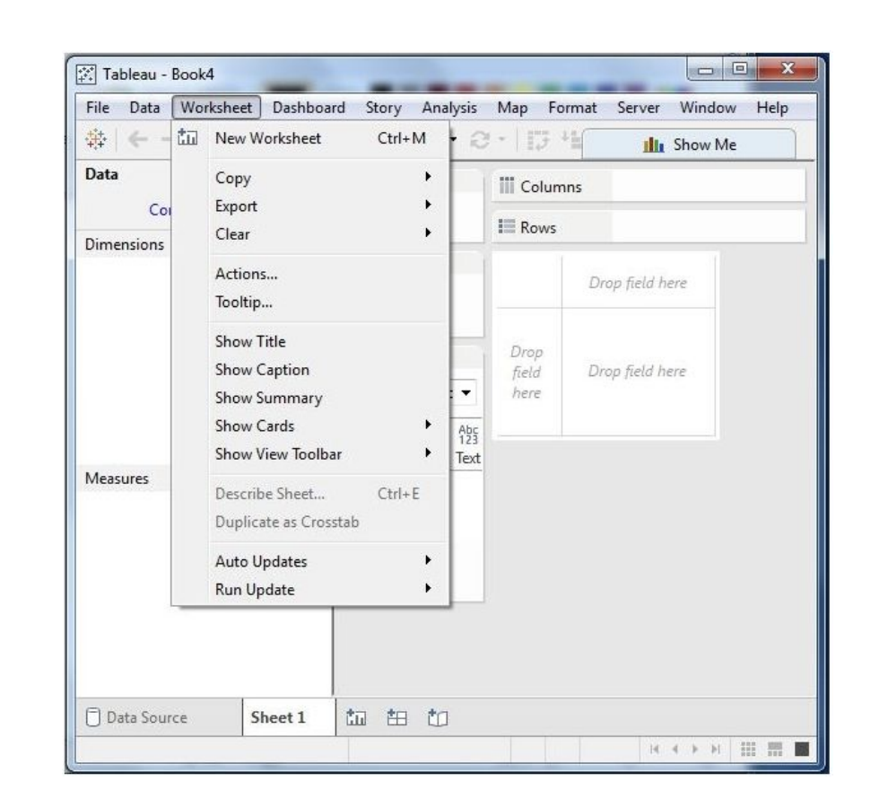
This can be used to create a new worksheet with various display features such as demonstrating the title and captions, etc.
The important features in this menu are as follows −
- Show Summary option displays the summary of the data present in the worksheet.
- Run Update option updates the data or filters in the dashboard.
- Tooltip shows the tooltip when hovering above various data fields.
Dashboard Menu
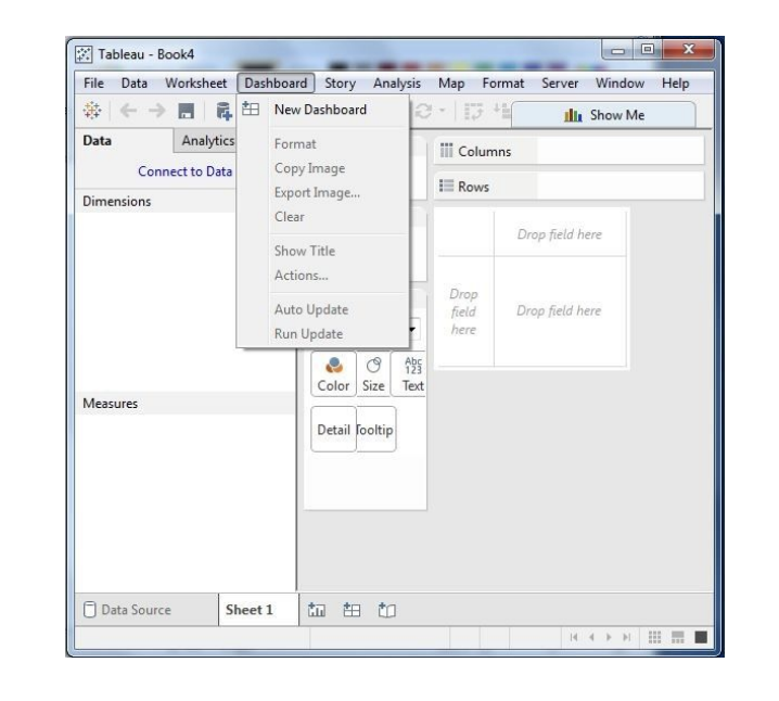
This menu is used to create a new dashboard along with various display features, such as showing the title and exporting the image, etc.
The important features in this menu are as follows −
- Format sets the layout for different sections of the dashboard
- Actions link the dashboard sheets to external URLs or other sheets.
- Export Image option shares visualisations of dashboard in image format
Story Menu
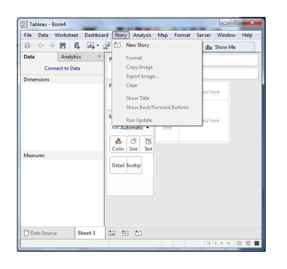
The story menu is one of the most used features in Tableau.
Some of the features under this are :
- Format option changes the layout in terms of colors and sections of the story.
- Run Update updates the story with the latest data from the source.
- Export Image option exports an image of the story.
Analysis Menu
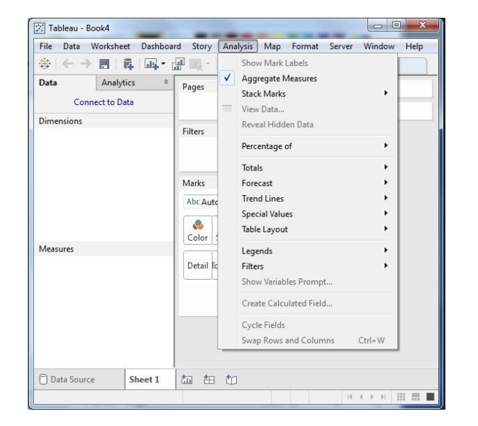
This menu contains features to analyse the data. Some of the tasks that can be performed are date manipulations, getting trend lines etc.
- Forecast gives a forecast using the given data.
- Trend Lines adds a trend line.
- Create Calculated Field option creates additional fields based on certain calculation on the existing fields such as difference between two fields.
Map Menu
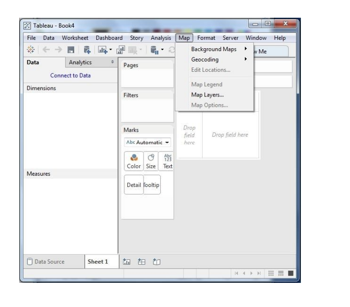
This menu is used for building map views in Tableau. You can assign geographic roles to fields in your data.
The important features in this menu are as follows −
- Map Layers hides and shows map layers, such as street names, country borders, and adds data layers.
- Geocoding creates new geographic roles and assigns them to the geographic fields in your data.
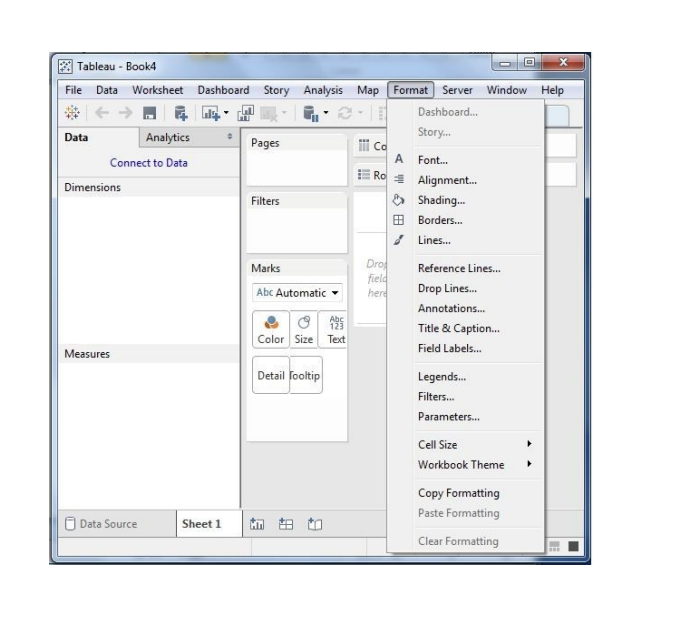
Format Menu
This menu sets various formatting features such as border, color, alignment of the text.
Some of the features in this menu are as follows −
- Borders applies borders to the fields displayed in the report.
- Cell Size customizes the size of the cells displaying the data.
- Workbook Theme sets a theme for the workbook.
Server Menu
Server Menu is used to login to the Tableau server if you have access, and publish your results to be used by others. It is also used to access the workbooks published by others.
The important features in this menu are as follows −
- Publish Workbook publishes the workbook in the server to be used by others.
- Publish Data Source publishes the source data used in the workbook.
- Create User Filters creates filters on the worksheet to be applied by various users while accessing the report.
Power BI
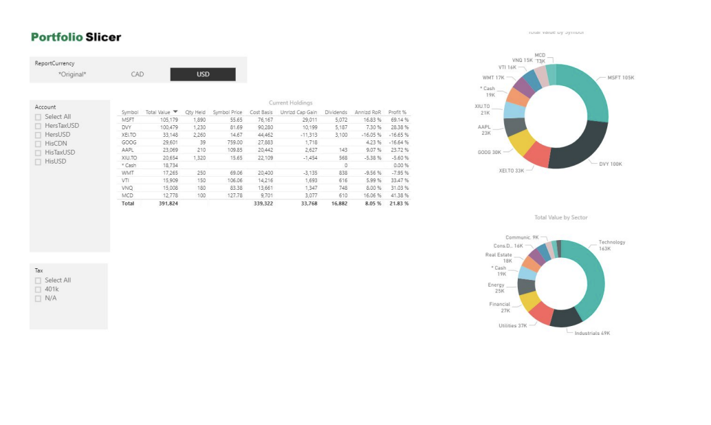
Another powerful data visualisation tool is Microsoft’s Power BI. Used in most of the companies for live data sharing and analysis, Power BI provides clean and intractable visualisations of data.
You can find more about Power BI here:
https://powerbi.microsoft.com/en-us/get-started/
Some visualisations created using power BI:
The Question?
The question most of the beginners eventually come across is, with so many libraries available to perform analytics and run machine learning algorithms should I spend time in understanding the mathematics behind them
The answer to this question depends completely on your outlook and aim to learn analytics.
If you want to learn ML not for the sake of learning it but to use it in order to solve another problem of interest, then there’s no need at all to dig deep into math. You can just use existing libraries like scikit-learn, keras, etc. To give you an analogy, this is basically like using Wordpress to create a website: if the reason why you’re building the website is what’s important to you, then don’t worry about learning HTML, CSS, Javascript, etc.
You must know that ML algorithms are not created out of a vacuum: they are a direct result of how their respective problems are modeled mathematically. For example, back-propagation algorithm is the direct result of applying the chain-rule (that one learns in multivariate calculus) to neural nets, or the K-means algorithm is nothing but alternating minimization applied to a constrained matrix factorization problem.
In short, you cannot avoid the ‘mathematics’ if you want to be more than just an end-user of ML.
